Showing posts with label content accessibility. Show all posts

Monday, April 11, 2011

The Easier It Is To Find Information, the Higher Your Conversion Rate

Accessibility:
It’s What A Web Site Is All About

Accessibility, when discussing web sites, includes a number of factors: easy navigation, understandable site text, no dead ends requiring a browser back click to escape (lots of users don’t even know browsers HAVE a back click).

Let’s start with the bottom line- yours: the easier it is for a site visitor to perform the most desired action (MDA), the more times that MDA will be performed.

Let’s Start With Navigation
Whether you go with a navigation bar at the top of the screen or a menu list in the first column far left, your navigation must be:

  • simple
  • unambiguous
  • truthful
  • always available
  • always in the same location 
Avoid numerous tabs, drop-down or flyout menus. Keep it simple. If visitors are faced with too many choices too soon on arriving at the site, chances are they’ll bounce.

Keep the navigation unambiguous. It’s routine to have a "Contact Us” page on a web site. If you label the contact link “Company Authority,” visitors are going to be totally confused. And again, bounce.

Truthful is just what it says. If the link says “Product Descriptions,” don’t make the visitor read through another landing page of sell copy. Deliver what the link says and go directly to the products.

Always available is an aspect of keeping visitors on site longer, and the longer they stick around, the more likely they are to perform the MDA. So, the navigation bar or menu should be available from every page so the visitor can surf at will, unencumbered by what YOU think the visitor wants to know.

Finally, keep the nav tabs in the same place. Don’t move them from bar to menu and back to bar. The last thing you want is a visitor trying to figure out how to return to the contact page to make contact.

Keep it simple. The fewer clicks required to get the visitor to perform the MDA, the better. So, go through the process and eliminate every unnecessary side road, dead end and yet another landing page.

Accessible Content
If your client site is for a professional medical dispenser, you can assume that the visitors have some knowledge of the subject, i.e. you don’t have to start from square one. But you still have to stay on target pointing out the benefits of buying the client’s medical products.

On the other hand, if you’re writing text for a hearing aid retail outlet, accessible text is understandable by the reader. So first, toss the thesaurus. Find the simplest, shortest way to say what needs to be said about products and services.

Be helpful and supportive to the new visitor. Make things simple to find, simple to learn and simple to bookmark. Returning visitors are gold. Eventually they buy something so earning a bookmark is a very good thing.

Skip the hype. Educate the visitor using simple terms, no jargon and listing benefits rather than features. This is the stuff site visitors want to know.

Finally, lay out the text so it can be scanned rather than read. No big, long paragraphs. Visitors scan from upper left to lower right so put your most important info upper left on the screen.

The easier it is to buy something, opt-in for a newsletter, or to complete a form, the more often those MDAs are performed. So make it as simple as possible (why do you think Amazon offers a one-click checkout? How easy can it be?).

Accessibility benefits both site owner and site visitor – a win-win. Also a no brainer.


Friday, March 26, 2010

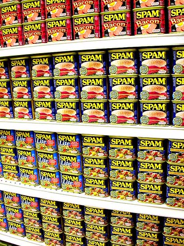
JEEZE, BOYCOTT CONTENT SPAM, WILL YA?

   wall of spam by chotda.
Content Spam 2.0:
What This Means to SEO

Weird email requests lately.

One guy wanted a bid on 1,000 articles – all about apartments. I doubt there are 1,000 things you could even say about apartments, much less write 1,000 articles on the subject. And if tasked with such an assignment, any self-respecting copywriter would gouge out her eyes with a spork after a day or two. Tops.

Another request wanted a price for a weekly newsletter on work-at-home jobs. Didn’t care what I wrote as long as it contained this list of 25 long-tail keywords. This isn’t writing. It’s a jigsaw puzzle and all the pieces are gray.

The move to content-driven sites, and the endless need for green content, has been good for word grinders who can crank it out by the pound. But there’s something in the ether-sphere. A change in the digital wind.

Elance.com: Lots for Cheap
I’ve been getting writing assignments through Elance for a little more than four years. And in that time there’s been a rather dramatic shift in what buyers in the writing and translation category want.

“500 articles on pig farming. Willing to go as high as $1 per article.”

“200-page ebook download on FOREX strategies – Budget > $500”

“30 press releases; various technical topics – Budget > $250”

Occasionally, buyers are actually more concerned with quality than quantity but those buyers are a shrinking pool. And this despite Elance’s behind-the-scenes efforts to improve the quality of its job posters.

Still, those cr@pfests of work get bids – out sourced to word factories where text by the kilo is produced by (1) machines (virtually unreadable) or (2) non-native English speakers who get paid in canned goods (humorously unreadable). A client sent one of these outsourced pieces for review and in it was the following quote: “American corporations are up to the business of the monkey.”

I read that 10 times before my wife figured out that the writer (or machine) had interpreted “monkey business” as “business of the monkey.” So, the sentence, when reconstructed would read: “American corporations are up to monkey business” and even that totally sucks.

Content Spam 1.0
Sure, this kind of junk has been around for years and there have been bottom feeders on Elance since the site started operations. So, admittedly, the use of content spam has been around since search engines (1994).

But early content spam was simplistic. Cram the words sex and porn into every keyword tag and you’d show up. Keyword dense gibberish (“Can you give me a 40% keyword density across the site?”) could be ground out like hash (and not the good kind).

But now, because search engine algorithms have gotten more sophisticated, content spam has taken on a new look.

Content Spam 2.0
The days of stuffing “blue pill” in between real text are over (except for that guy in the Philippines, and I’ll get you, you bastard!). Today, search engines want solid, informational content – something of substance, of use to the search engine user. The problem for copywriters is simple. Search engines know informational content. But they don’t know good content from a steaming pile of verbs and nouns.

This limitation has led to a huge number of posts on Elance and other freelance sites for words by the pound. Quality doesn’t get any extra credit. It’s sheer volume and plenty of it.

The Impact on SEO
This content spam 2.0 is used by site owners and SEOs to create sign posts that point back to the mother site – the center of the marketing bull’s eye. So the content ends up on blogs, on content syndication sites, on content-based sites, on sub-domains – it’s like putting up posters on construction site walls in New York City.

And though SEO has always involved creating identifiable targets for bots and eyeballs, this off-site aspect of SEO seems to be growing in importance. Why else would some guy want 1,000 pages on apartments? He’s going to place that content spam every place he can – or you are.

Based on the number of requests for content spam posted on Elance and showing up in my inbox, I suggest that SEO is going to employ a great deal more off-site activity in the future.

Anybody know anything about apartments?


Friday, January 29, 2010

IF THEY CAN'T FIND THE INFORMATION, THEY'RE GONE!

Website_Map by Veribatim.

Accessibility:
It’s What A Web Site Is All About

Accessibility, when discussing web sites, includes a number of factors: easy navigation, understandable site text, no dead ends requiring a browser back click to escape (lots of users don’t even know browsers HAVE a back click).

Let’s start with the bottom line- yours: the easier it is for a site visitor to perform the most desired action (MDA), the more times that MDA will be performed.

Let’s Start With Navigation
Whether you go with a navigation bar at the top of the screen or a menu list in the first column far left, your navigation must be:

  • simple
  • unambiguous
  • truthful
  • always available
  • always in the same location

Avoid numerous tabs, drop-down or flyout menus. Keep it simple. If visitors are faced with too many choices too soon on arriving at the site, chances are they’ll bounce.

Keep the navigation unambiguous. It’s routine to have a "Contact Us” page on a web site. If you label the contact link “Company Authority,” visitors are going to be totally confused. And again, bounce.

Truthful is just what it says. If the link says “Product Descriptions,” don’t make the visitor read through another landing page of sell copy. Deliver what the link says and go directly to the products.

Always available is an aspect of keeping visitors on site longer, and the longer they stick around, the more likely they are to perform the MDA. So, the navigation bar or menu should be available from every page so the visitor can surf at will, unencumbered by what YOU think the visitor wants to know.

Finally, keep the nav tabs in the same place. Don’t move them from bar to menu and back to bar. The last thing you want is a visitor trying to figure out how to return to the contact page to make contact.

Keep it simple. The fewer clicks required to get the visitor to perform the MDA, the better. So, go through the process and eliminate every unnecessary side road, dead end and yet another landing page.

Accessible Content
If your client site is for a professional medical dispenser, you can assume that the visitors have some knowledge of the subject, i.e. you don’t have to start from square one. But you still have to stay on target pointing out the benefits of buying the client’s medical products.

On the other hand, if you’re writing text for a hearing aid retail outlet, accessible text is understandable by the reader. So first, toss the thesaurus. Find the simplest, shortest way to say what needs to be said about products and services.

Be helpful and supportive to the new visitor. Make things simple to find, simple to learn and simple to bookmark. Returning visitors are gold. Eventually they buy something so earning a bookmark is a very good thing.

Skip the hype. Educate the visitor using simple terms, no jargon and listing benefits rather than features. This is the stuff site visitors want to know.

Finally, lay out the text so it can be scanned rather than read. No big, long paragraphs. Visitors scan from upper left to lower right so put your most important info upper left on the screen.

The easier it is to buy something, opt-in for a newsletter, or to complete a form, the more often those MDAs are performed. So make it as simple as possible (why do you think Amazon offers a one-click checkout? How easy can it be?).

Accessibility benefits both site owner and site visitor – a win-win. Also a no brainer.


Webwordslinger.com